Before DuffAM ever listed a custom photo lithophane for sale, one print went through four real passes — same photo, same printer, four completely different results. This isn't a marketing mockup of "before and after." It's the actual sequence: default settings, then machine calibration, then layer optimization, then the final tuned settings that became the process used on every lithophane sold since.
| Pass | What changed | What it looked like |
|---|---|---|
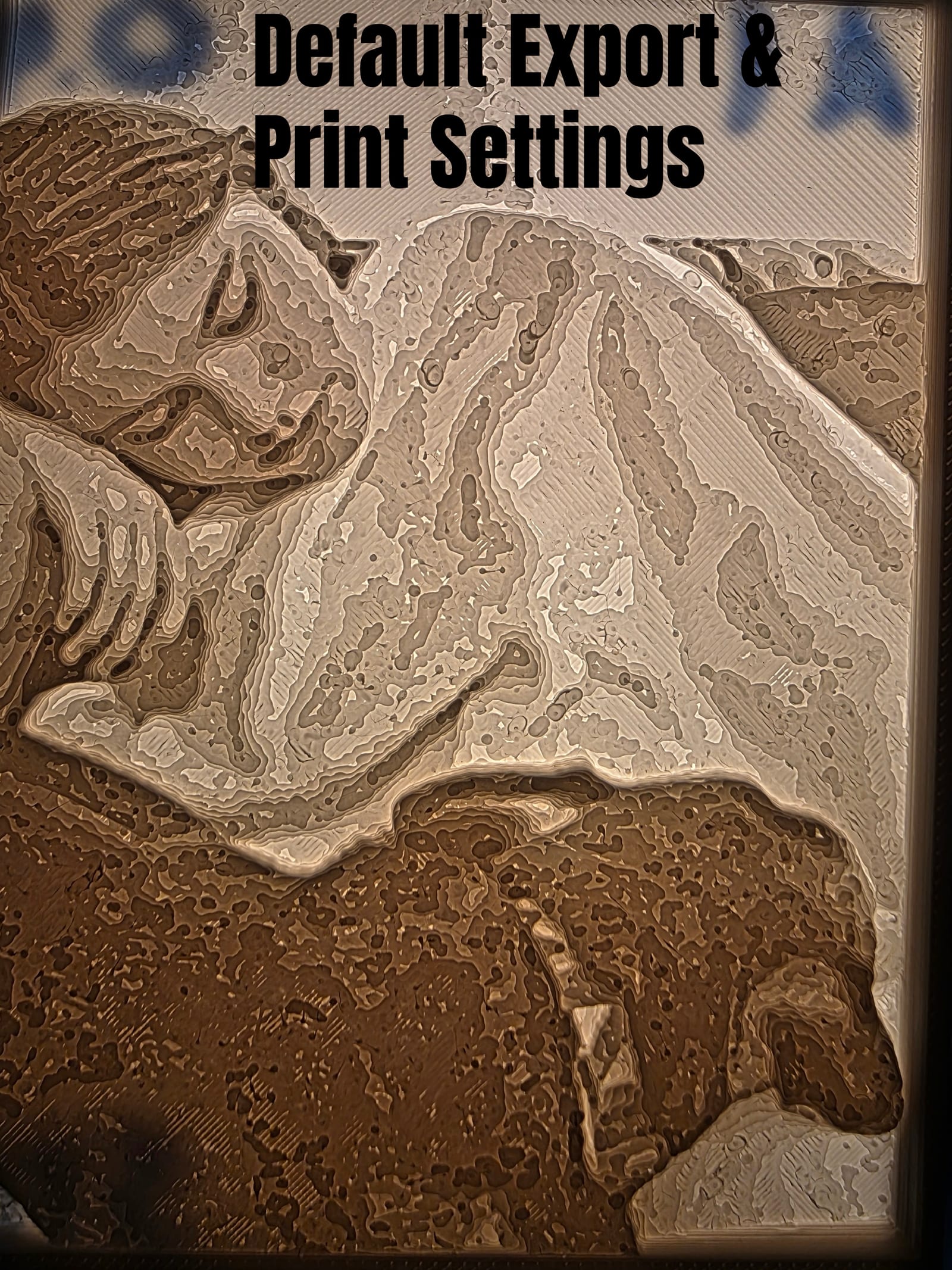
| 1 — Default Export & Print Settings | Slicer defaults, no lithophane-specific tuning | Harsh, blotchy, high-contrast — closer to a woodcut than a photograph |
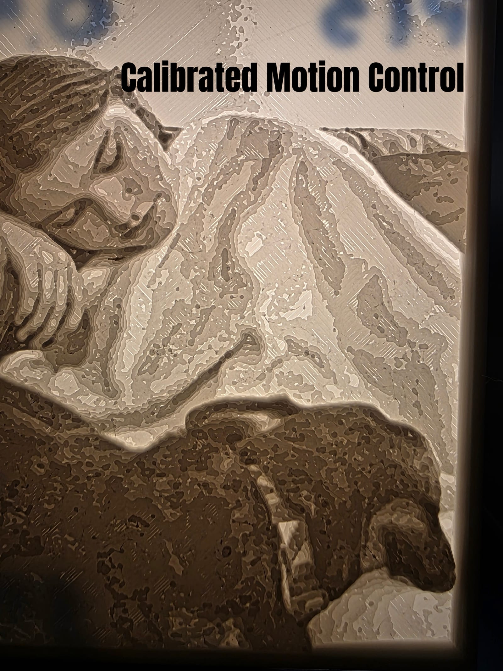
| 2 — Calibrated Motion Control | Machine motion/resonance calibration | Smoother, less harsh, but still visibly rough gradients |
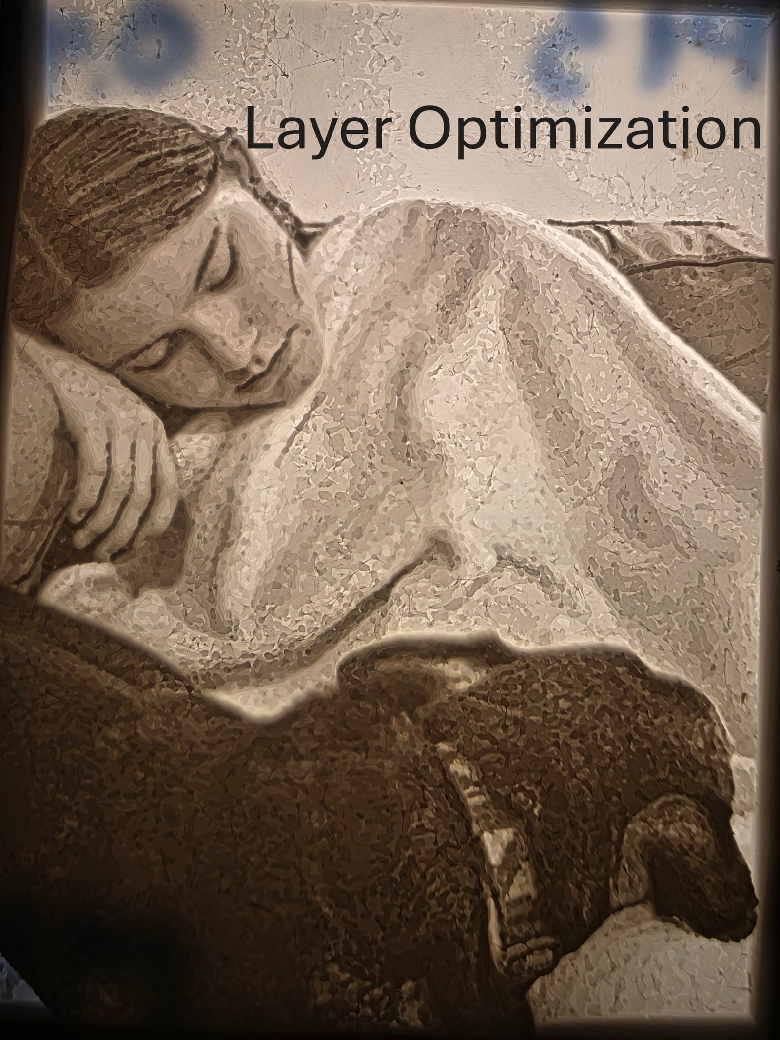
| 3 — Layer Optimization | Layer height tuned specifically for gradient resolution | Real jump in fine detail — facial features actually readable |
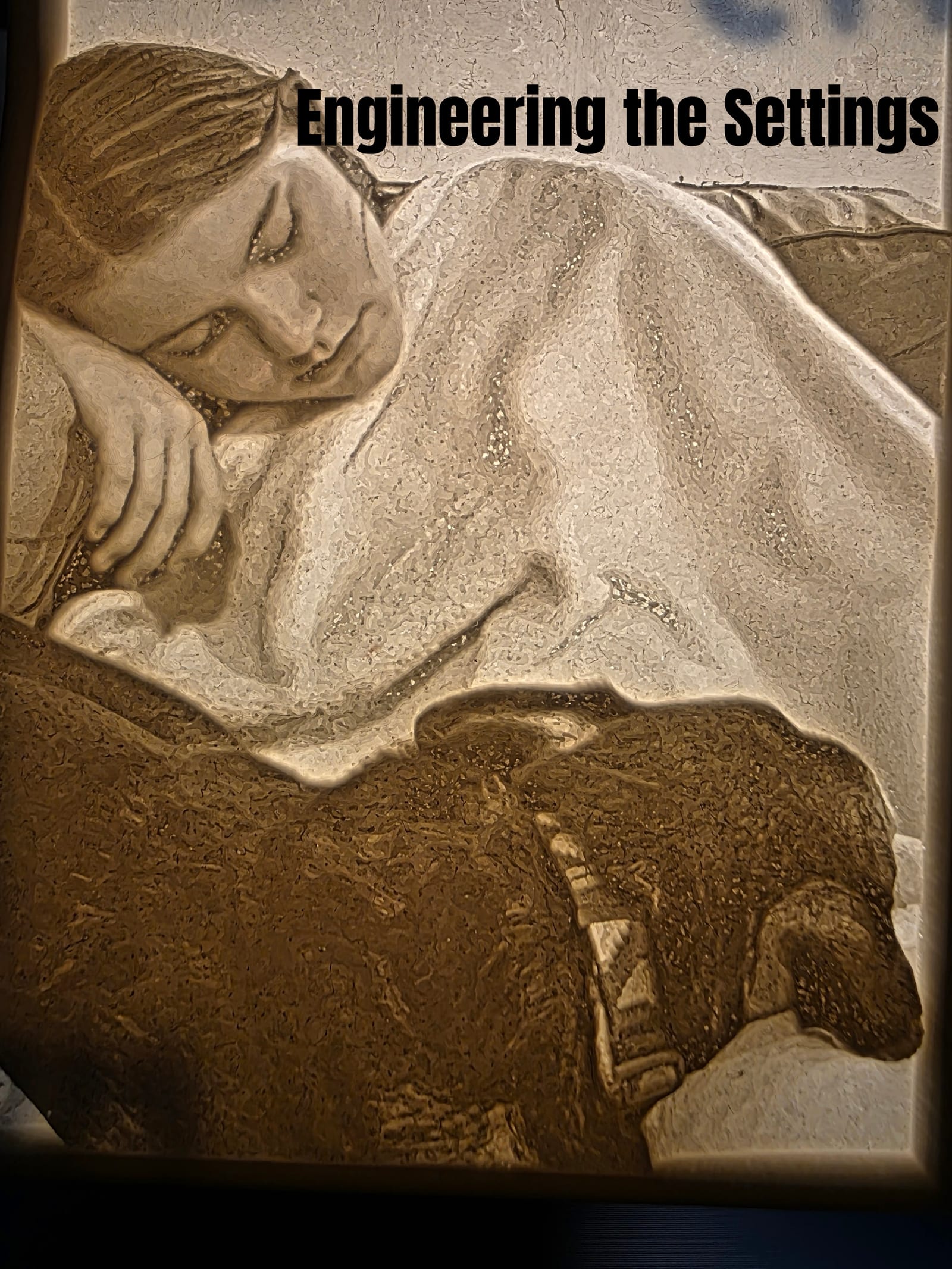
| 4 — Engineering the Settings | Full parameter pass, tuned end to end | Smooth, near-photographic tonal range |
Why a Lithophane Lives or Dies on Wall Thickness
A lithophane isn't printed like a normal part. The image only exists because the wall thickness varies continuously across the panel — thin sections let more light through and read as bright, thick sections block more light and read as dark. There's no ink, no pigment, no separate image layer. The entire photograph is encoded as a physical thickness map, and it only resolves correctly with a light source behind it.
That means a lithophane's quality isn't really about how "good" the printer is in general. It's about how precisely the slicer and the printer can hold a smooth, continuous thickness gradient across thousands of tiny steps. Get that wrong and the print doesn't just look slightly off — it looks like a different medium entirely.
Default Settings: A Woodcut, Not a Photograph
The first pass used the slicer's default export and print settings — no lithophane-specific tuning at all. The result was harsh: high-contrast, blotchy tonal transitions, and visible banding where the gradient should have been smooth. It reads more like a woodcut print or an engraving than a photograph. That's not a defect in the printer — it's what happens when a process built for continuous grayscale gets run through settings tuned for generic solid parts.
Calibrating the Machine
The second pass calibrated the machine's motion control before touching the print settings again. That cleaned up some of the roughness — the transitions got smoother and less jarring — but it didn't fix the underlying problem. Mechanical calibration matters, but it wasn't the actual bottleneck here. The gradient resolution issue was still there underneath it.
Layer Optimization Is Where It Actually Turns
The third pass is where the real jump happened: tuning layer height specifically for how a lithophane encodes tone, not for general print speed or surface finish. That's the detail most default profiles get wrong — a layer height that's perfectly fine for a functional bracket is nowhere near fine enough to resolve a smooth photographic gradient. Once layer height was actually optimized for the gradient itself, facial features that were unreadable in pass 1 became genuinely legible.
Engineering the Final Settings
The fourth pass tuned everything else end to end against that optimized layer height — mapping the print's thickness range to the photo's actual tonal range instead of a generic default. The result is smooth, near-photographic — the kind of quality that's worth putting a name behind. These are the settings DuffAM actually uses now for every lithophane that ships, not a one-off lucky result.
This Happened Before a Customer Part Ever Shipped
None of these four passes were run on a paying customer's order. This was R&D — the unglamorous, un-photogenic work of finding out where a process actually breaks before offering it for sale. It's the same standard applied everywhere else at DuffAM: motion control calibration, pressure advance tuning, material-specific settings — not defaults, not guesswork. A lithophane that ships from DuffAM today is built on a process that already failed three times in testing, on purpose, until it didn't.
Have a Photo You Want Turned Into One of These?
Send the photo and I'll tell you honestly if it'll hold up as a lithophane before you order — not every image has the tonal range for it.
Order Direct at DuffAM →